By Kami Agence
(2025)
About the project
AULAC is a manufacturing company specializing in foam-based products,
providing material solutions for industrial and consumer applications.
The project focused on rebuilding the brand identity
to reflect a more modern, structured and professional image,
aligned with the company’s long-term development.
SOW
Logo, Branding
CREATIVE DIRECTOR
Suke Tran
DESIGNER
Lina Nguyen, Linh Chu
PROJECT MANAGER
Gina Nguyen
The old identity felt outdated and decorative, lacking the sense of strength and precision needed for a manufacturing brand.
AULAC needed a visual language that communicates:
• stability
• structure
• durability
• forward movement
The challenge was to transform the brand into something more modern and confident,
while still keeping a sense of familiarity from the original logo.
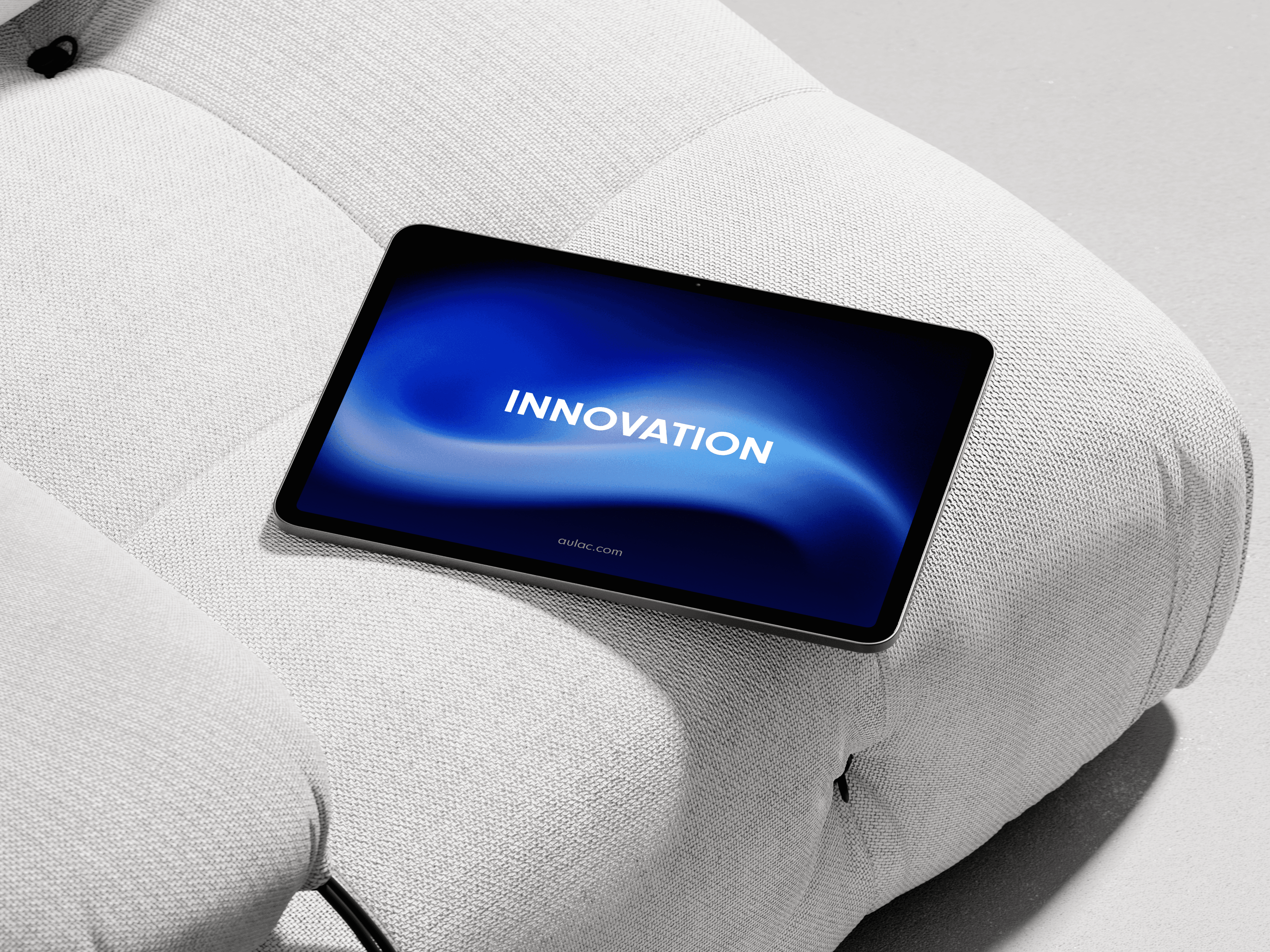
The new identity had to work across many applications - from product packaging to digital platforms and factory environments.


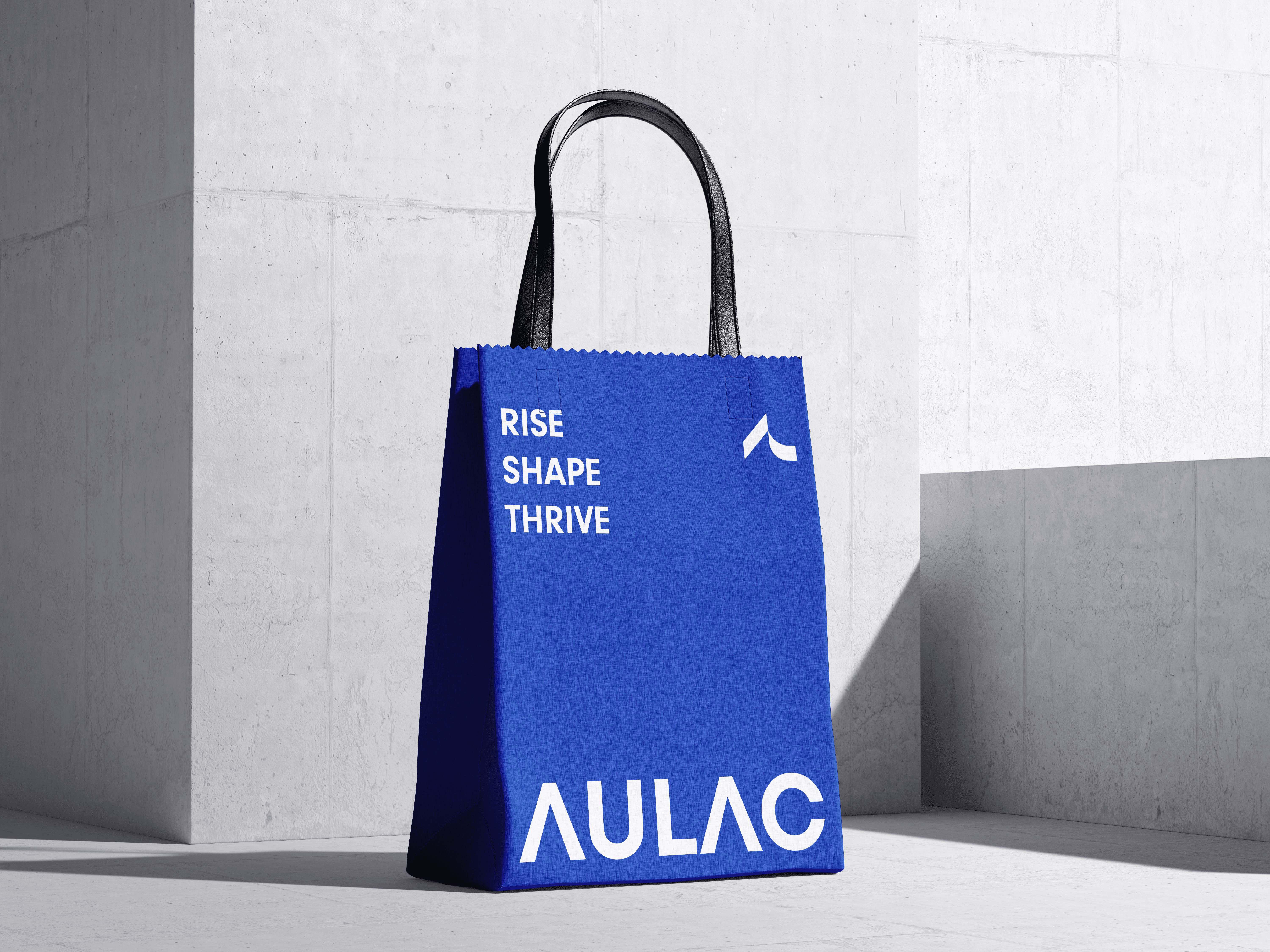
The new symbol is built around the idea of movement and direction. Inspired by the structure of interlocking foam mats, the identity represents connection, foundation, and continuous progress.
The upward shape suggests forward motion,
while the solid geometry reflects stability and engineering precision.
This concept becomes the core idea of the entire visual system.

Beafore
After